This next is my first “gift” – a blank card to be given as a thank-you for a friend who received a gift from the Queen. She is a twin, a warrior and a Viking persona. Her colors are the blue and white that I used for the card. Her heraldry is a rabbit facing a crescent moon (opposite her twin’s). The design of the left border is from a stone….it looks uneven and rough, because the stone was and I wanted to keep that feel…though anyone not knowing the source might think it just sloppy. Hindsight. I took a photo of a period brooch and turned it into the bunny at the bottom. The “words” are a transliteration of Viking runes, as nobody really knows the language and how it was used – the things you learn! It is a fun personalized descriptive of the Queen. As a side note, I saw her post on Facebook about it….she was thrilled and this was my first feedback from a recipient…..what a rush!

The left detail is from the stone Gosforth Cross, St. Mary’s….10th century Viking. The rabbit is taken from a Celtic British brooch about 8 AD, and the words are a transliteration of Viking Runes as “Sinister Wonder Bunny” a reference to the recipient’s left handedness (vs her twin) and a nickname that was given to her a long time ago.
This brings out a big point for me, and one which I try to follow… I am a FIRM believer in personalization — making a scroll pertinent to the recipient’s interests/persona/likes/story. It has to be MORE than just pretty; I want them to recognize the personal touches to know that THIS was specifically made for THEM. It can be subtle or blatant, as the occasion warrants, but personalized is my ambition.
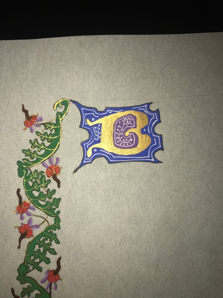
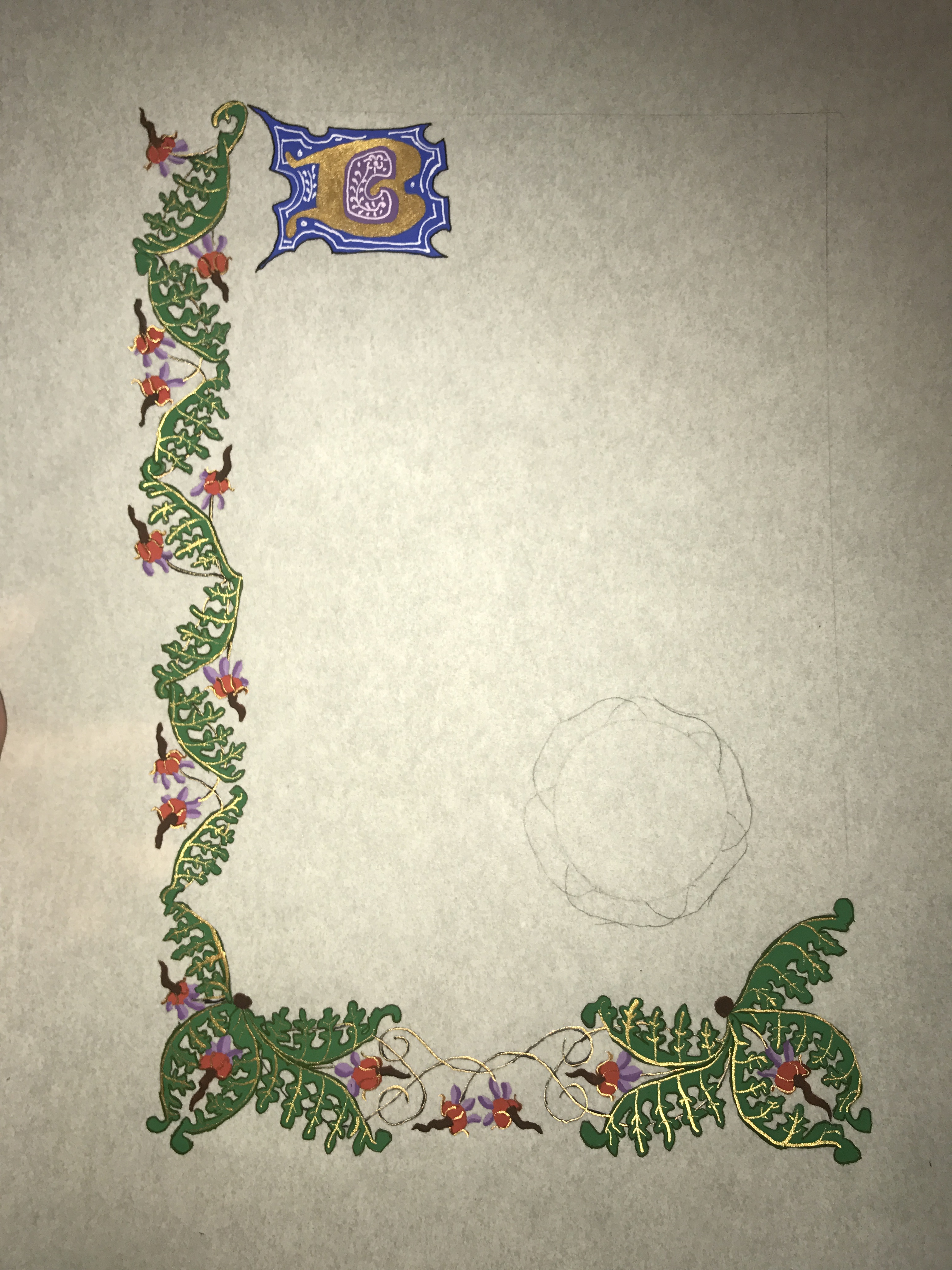
Following this, I wanted to try my first “real blank, working from an exemplar. I found that I needed to extend the base a bit and so I attempted to mimic the style of the original. I do feel that it fit fairly well. This was a pattern that I was drawn to in Catherine of Cleeve’s book…it was different, it was strange, and I loved the flowers and leaf shape. This was really also a first attempt at trying to understand HOW the original was painted…which colors were placed down first, what technique was used to highlight, etc. I was not happy with making the lines, frustrated in trying to duplicate the smoothness and continuity of the original. The leading initial “B” leaves much to be desired. This was still me working on emulating styles rather than picking an exemplar. It is flat, and rather plain.
Gouache on pergemenata, gold mica paint.
Exemplar: Hours of Catherine of Cleese’s, Netherlands, ca. 1440.
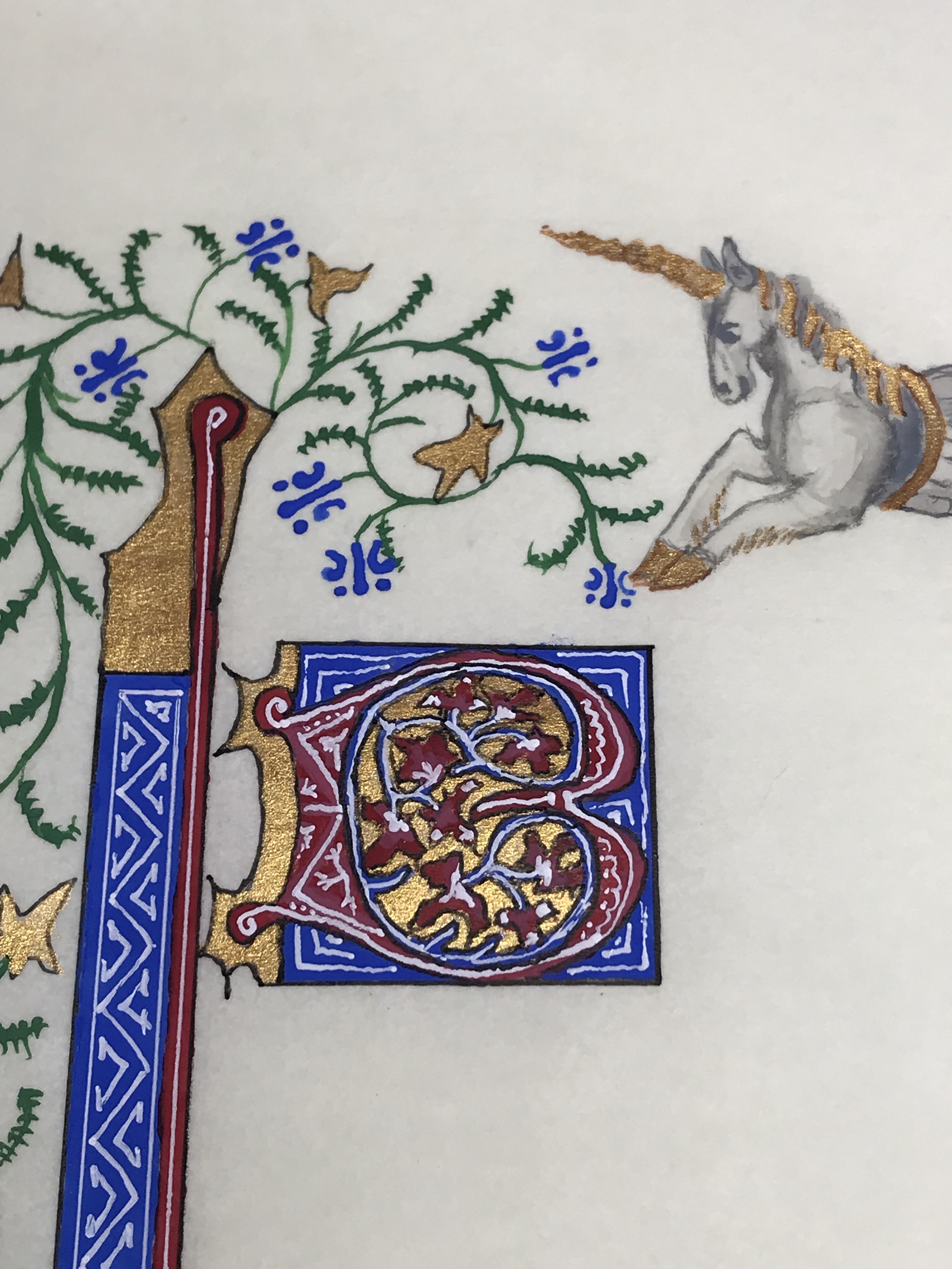
From this I felt brave enough to do another blank. This one was more of a challenge and I wanted to create a theme. Using some artistic license, I took merfolk from different pages and combined them. I also pulled a seahorse from a different source, and since Atlantia’s symbol is Spike, a horned seahorse, I added a horn. The challenges were shading…clothing on the Knight, the face (and ESPECIALLY reflection) of the mermaid, and Spike’s musculature and face. This was my first attempt at geometric patterns….the white work took a bit of thought. Still with an ink pen, I had tried a crow quill, but couldn’t get it to flow (not knowing how to prep it) and I didn’t own a nice enough brush to create delicate white lines. You can see the progression from my rather plain “B” capital in the first blank to this one…
Gouache, archival white ink, Gold mica paint, Micron pen.
Exemplars:
1. Merhorse (modified) from 13c De Natura Rerum by St. Alberta’s Magnus.
2. Multiple pages, Book of Hours, Paris France, approx. 1410, Follower of the Egerton Master.