Court Baronage award, stepping down from his position of Baron of Caer Mear.
I confess that I wanted this to be elaborate and golden and full of fancy decorations. To which his wife replied, “Umm, no.” She explained that he was a simple man who really liked geometric designs and his favorite colors were blue and gold (his heraldry colors). Oh, and could I fit in a portrait of their dog?
Now those who know this amazing man know he is beautifully dedicated and skilled.. He has received ALL the awards of Atlantia, some of which no longer exist. He is the oldest active knight in our kingdom. But, I feel that the scroll should speak to the recipient (as I have noted before) and who would know him better than his spouse?
Research brought me to the exemplar that I used, it fit the bill of geometric and correct colors, but was not stark or plain.
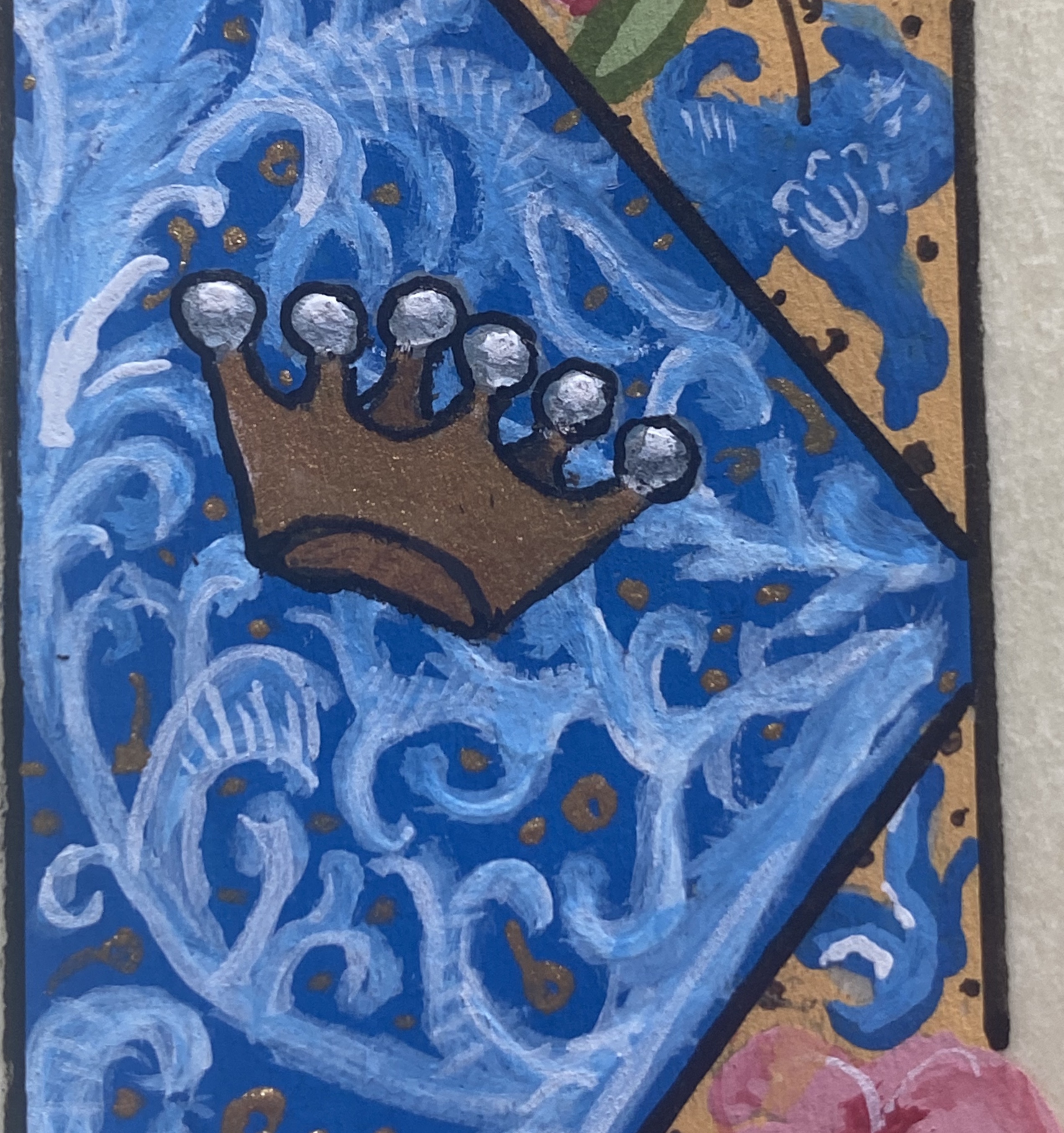
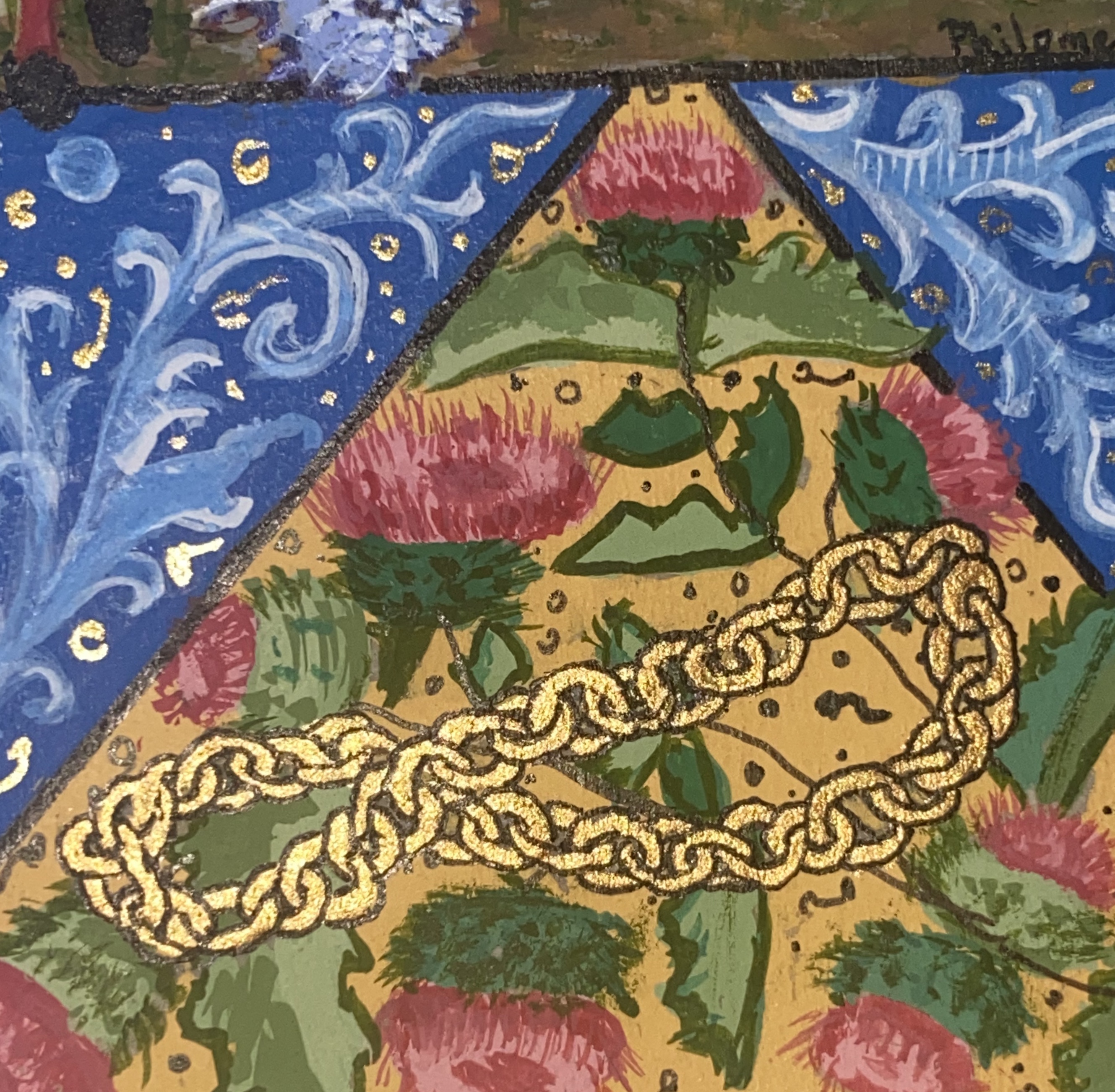
In place of the marginalia, I placed his achievements….his Baronage, his Laurel, his Pelican and his Knight’s Chain. I also placed him alongside Spike, holding is favorite weapon. And of course, his pup received a place of honor in the primary initial!
From the Gallica, “Brevium as usum fratrum Predicatorium…Baronial coronetLaurel and pup, surrounded by paw prints.CutenessPelicanKnight’s Chain
This was gouache painted on pergamenata, with gesso and gold leaf. The chain is shell gold.
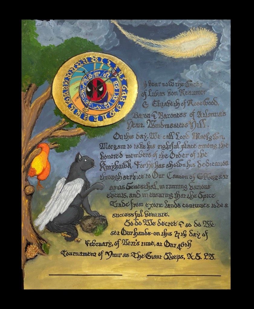
Order of the Kittyhawk Baronial Award, Windmasters’ Hill, Atlantia
Where to begin with this one? The recipient’s wife advised me on this person’s passions which happen to exist between service and science fiction. While most would feel that this scroll is not “period appropriate” , I would beg to differ. I feel that this is a beautiful melding of old and new, personalized tradition that is unique to this individual.
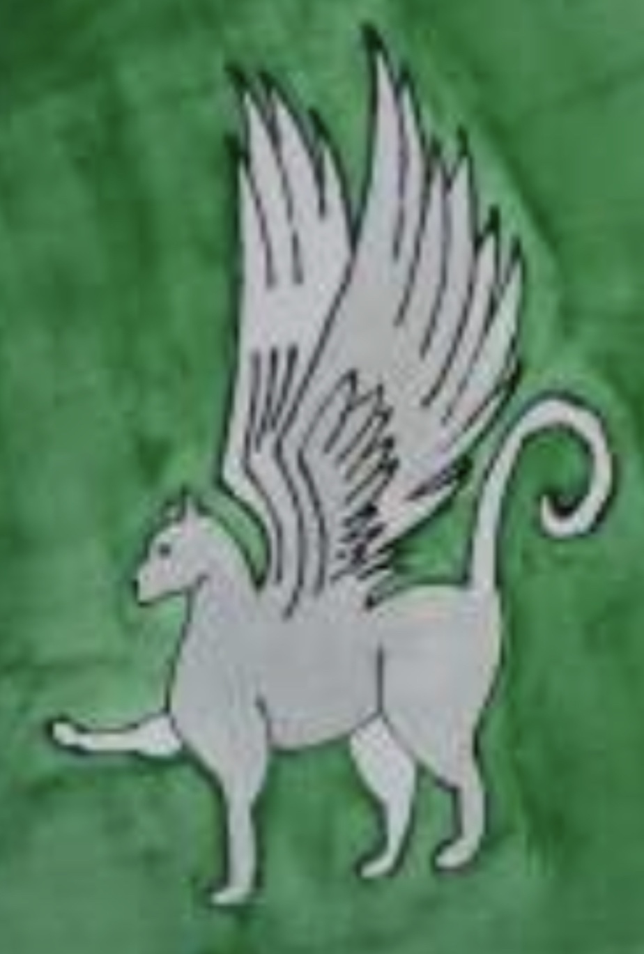
Windmasters’ Kittyhawk is a cat with wings. It has gone through many many iterations, from something vaguely dragon-like to a current hissing representation created over a decade ago by our then-MoAS. With this knowledge comes freedom. I was able to play and make an outline drawing into a realistic winged cat. Therefore traditionally non traditional.
Kitty Iterations
Next Sci-Fi. The recipient had varied interests including Star Trek (he’s a member of a RPG), Harley Quinn, Deadpool, and Firefly. How to fit these in? Science…astronomy….two things sprang to mind.
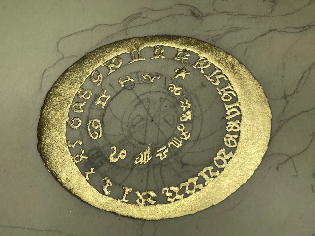
The first was the gorgeous awe-inspiring Astronomical Clock, aka the Orloj, which is located in Prague, in the Czech Republic. Created in 1410 by Mikuláš of Kadaň and Jan Šindel with calendar dial, zodiac signs & the sculptures added around 1490. Below the photo is a link to a more recent article about its wonders and some new discoveries.
For my purposes, this was beautifully perfect. The colors are drool-worthy, the gold numerals and bars….and all of the dials and circles. This was created, as was the rest of the scroll, using gouache. The gold is 24k leaf over my raised gesso recipe.
Laying down the goldThe completed anachronistic clock face.On the face in the center is Deadpools’s symbol. The hands of the clock have Harley Quinn’s mallet and the Star Trek symbol/communicator device.
Next was an exemplar that was advanced for its time, showing comments and other similar phenomena. I found a comet that fit the scene, including the background colors, forming in my head and suited my “Easter Egg” surprise within its center.
Inside of the center of the comet, visible only under a black light, is the USS Enterprise, taking off as the Kittyhawk watches.
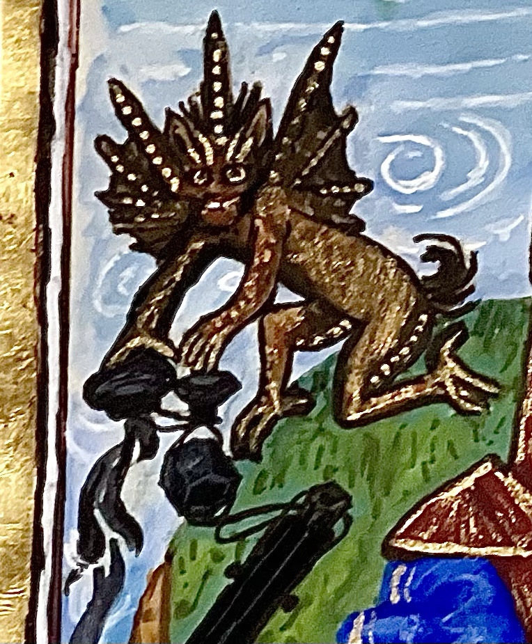
Grasped within his tail is a key, the symbol of a seneschal as well as the key from the recipient’s heraldry.
Hanging from a branch is Jayne’s hat from Firefly. And finally, tucked into the crevice at the bottom of the tree is an escapee from the ship, a Tribble.
The scroll is gouache on pergamenata, gesso and gold leaf.
This had a few challenges ….it was my second scroll writing over gouache, and never this thick…it worked for the most part. I had originally thought to use a white ink, but it looked horrible and had to be redone along with a portion of the background. The clock face angles, colors and keeping proportion was a test as was creating the spaceship…in the dark with a black light shining on the page as I put down the ink.
This scroll brings me joy….it’s a story being told in front of your eyes, with mysterious clues and secrets.
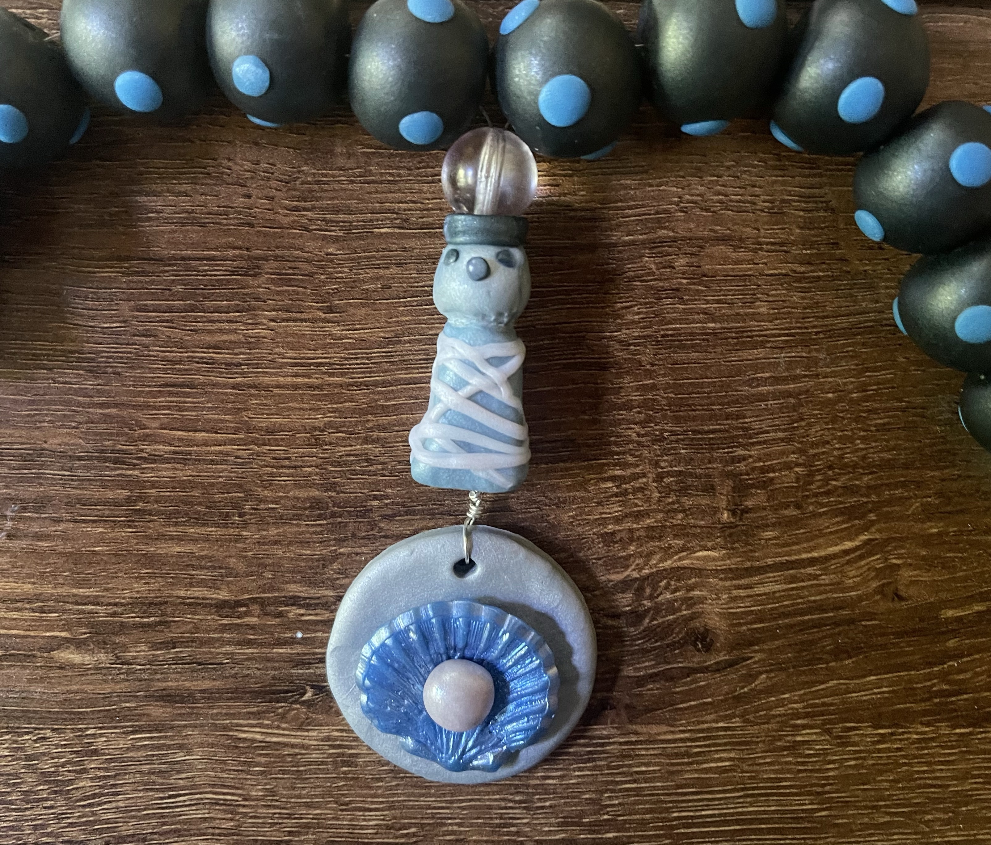
This recipient is quite knowledgeable about Viking clothing, accessories and timelines for the known clothing. As such, I wanted something that was precise and exemplified her chosen period.
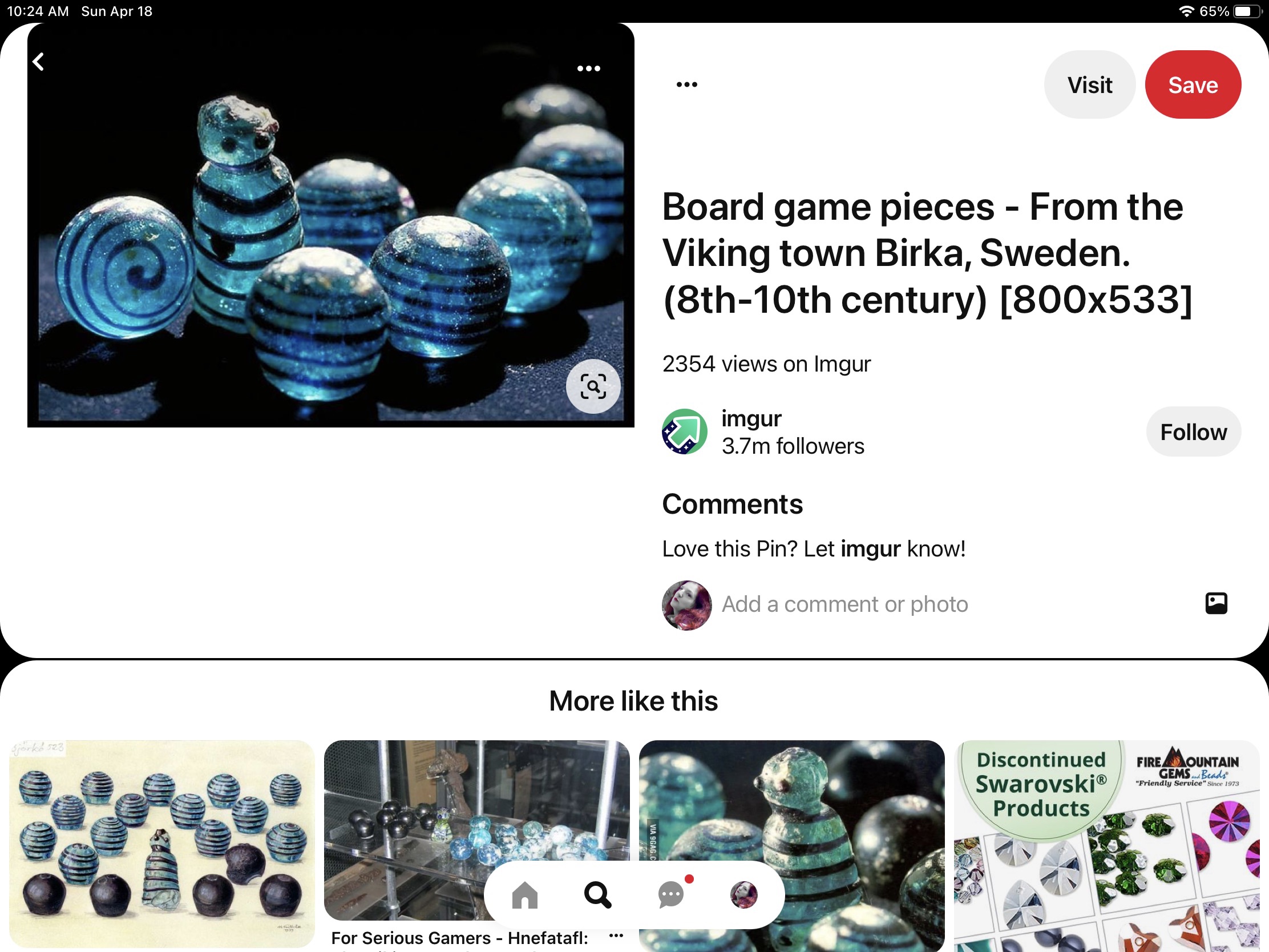
While researching other scrolls, I had come across these gorgeous glass and angler playing pieces. Digging deeper showed them to be a part of a game called Hnefnatafl. Much to my delight, I discovered that there were grave finds of boards. I particularly liked the Knockanboy board as it had side handles which I could put to good use.
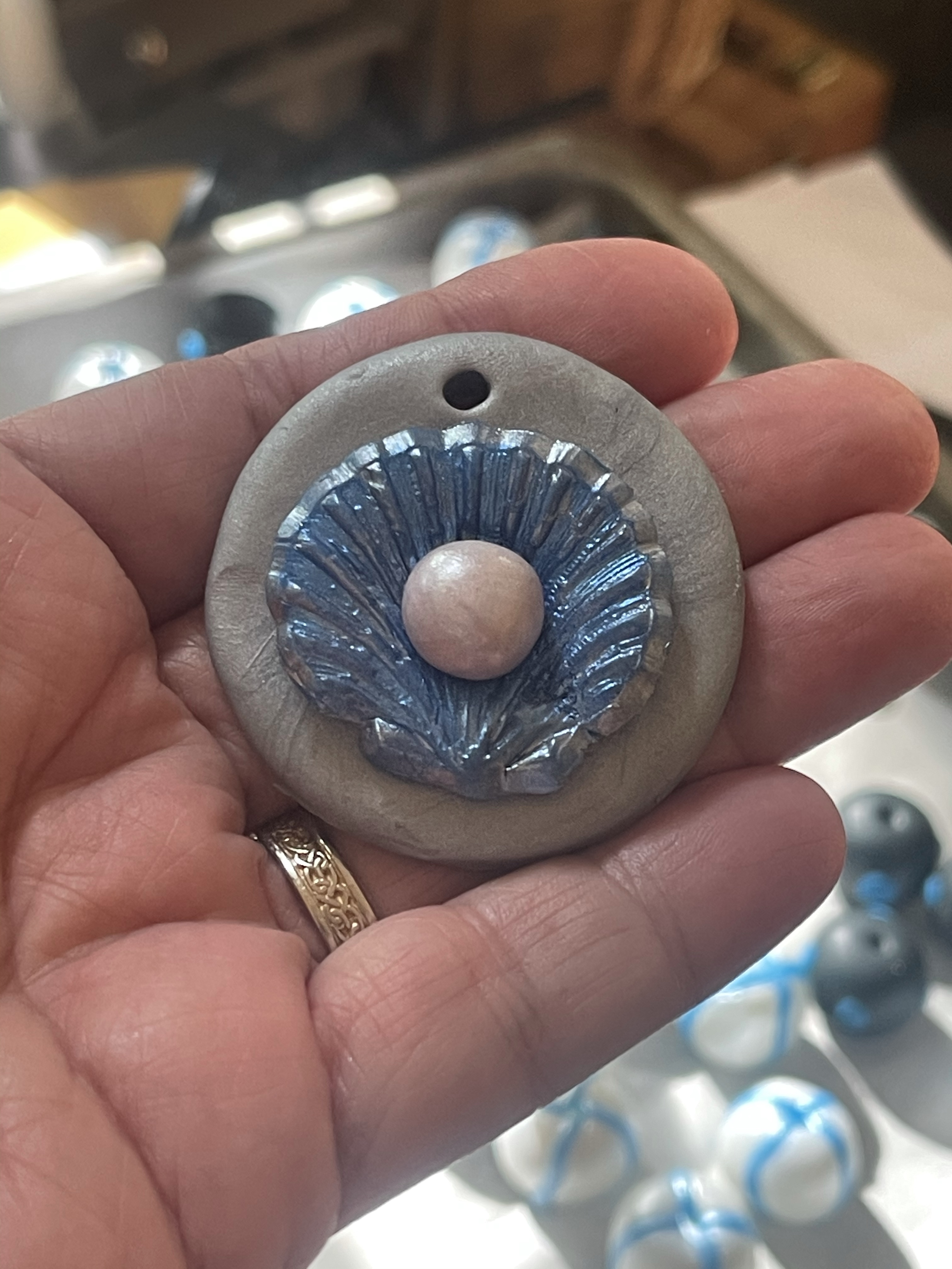
As I don’t blow glass and time was short, I created playing pieces out of Fimo clay and baked them with holes down the centers to turn into beads. The King piece was also clay, and I created the award emblem (a Pearl on a half-shell) as well.
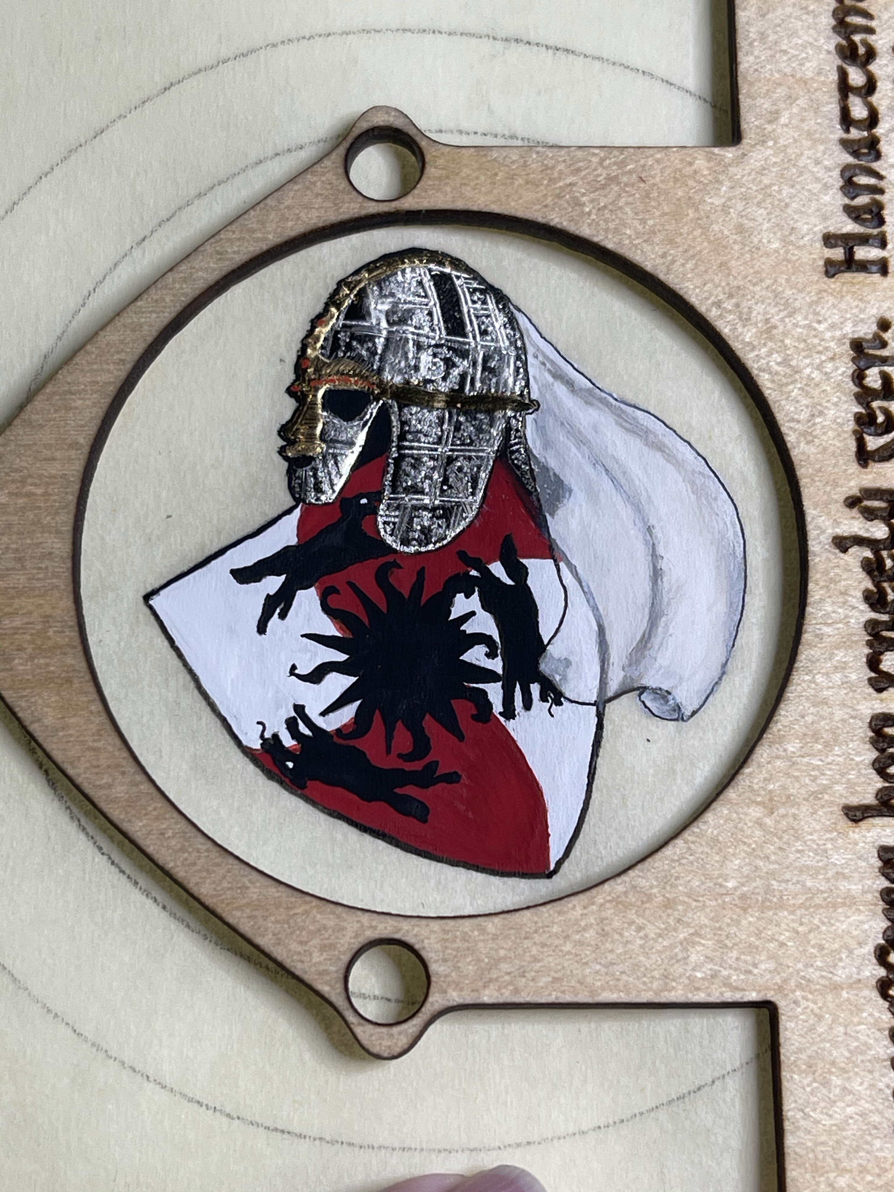
I enlisted my Laurel, Goodwife Michel Almond de Champagne, to help recreate a playable board, based upon measurements of the original (and to which the pieces were sized). We spent a good part of a morning working on the board, and then she had her laser cut out the base and frame, Where the handles were on the original, we created “picture frames” — one for signatures and one for the helm and veil over her heraldry which is part of the award. The wording was done in Norse (for her persona) and used as scrollwork decoration around the frame.
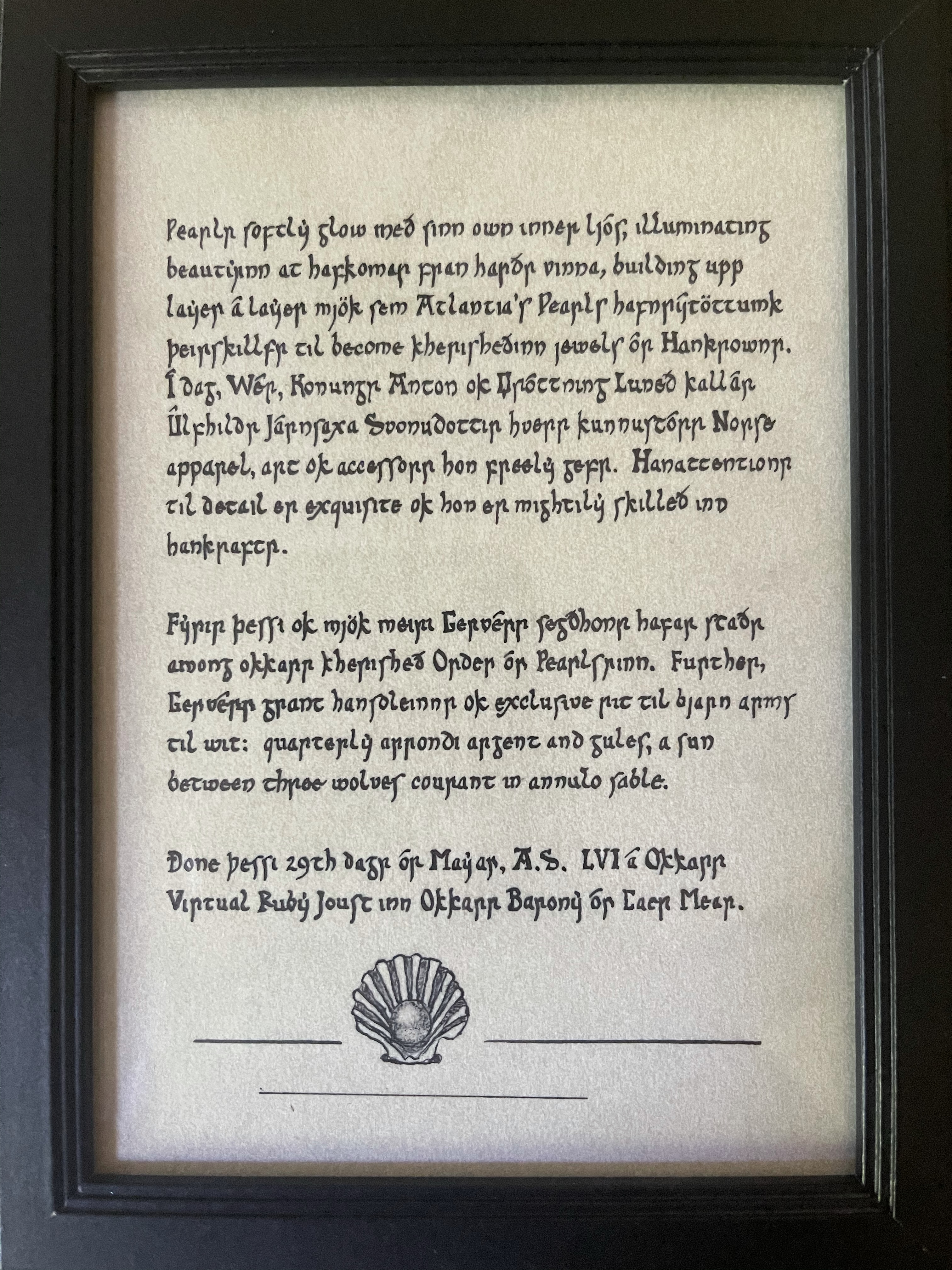
I also added in a small 5×7 pergamenata and ink write-up of the wording for her to hang adjacent to her board with a Pearl done in ink Squashed Bug technique at the bottom.
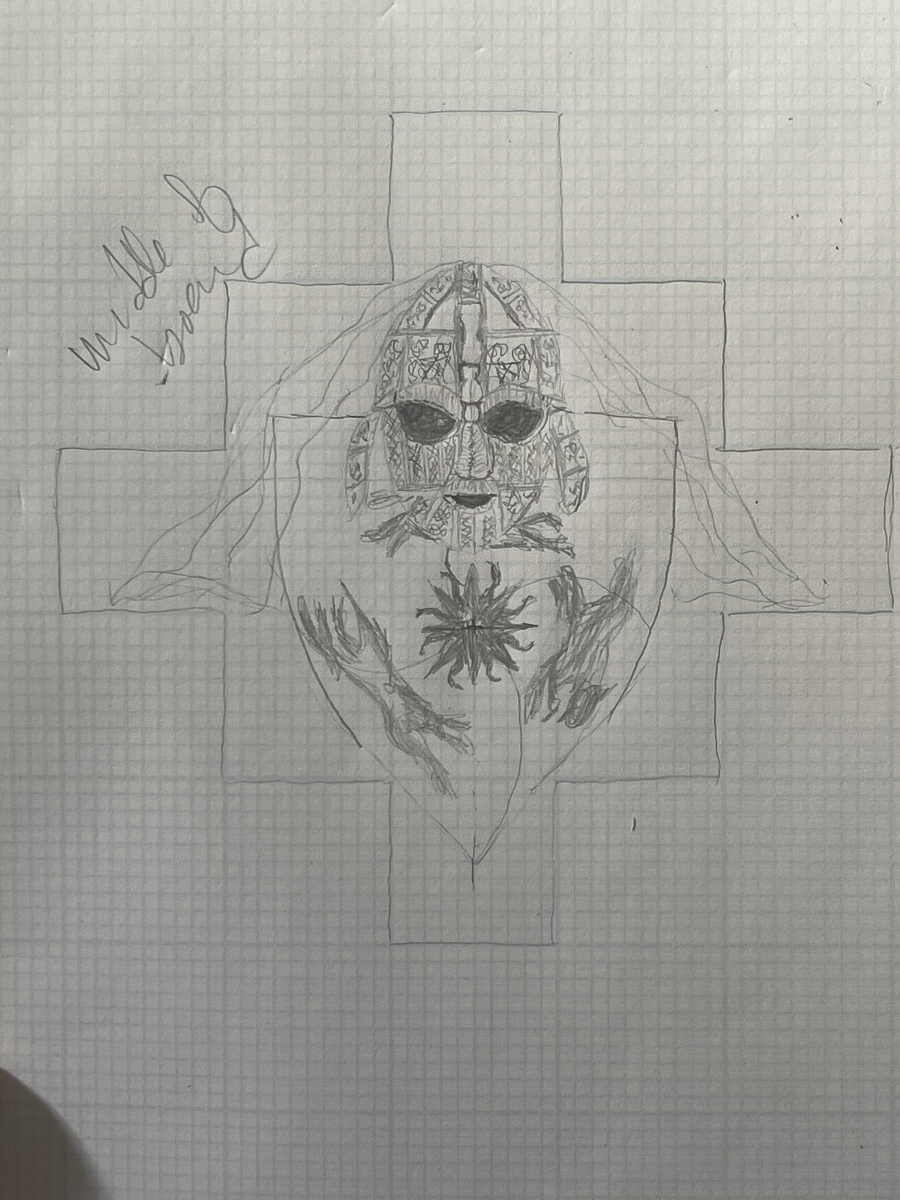
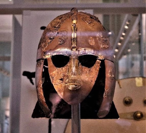
The helm is that of the recreated Sutton Hoo, again, to fit her persona’s timeline. It was made on pergamenata, using my homemade gesso and moon gold leaf & 23k gold leaf to mimic the gold and silver of the original with embossing to recreate the patterns and pictures of the helm. The veil is my use of Squashed Bug style to make it appear translucent over the heraldry and helm where it draped.
The playing pieces are not really meant to be worn, but I strung them together to create the strand of jewels which would hang between a woman’s brooches holding up the overdress when the board was mounted to the wall.
Wooden board, Fimo clay playing pieces, pergamenata side pieces and gouache. Gesso (made by me), with Moon gold and 23k gold leaf.
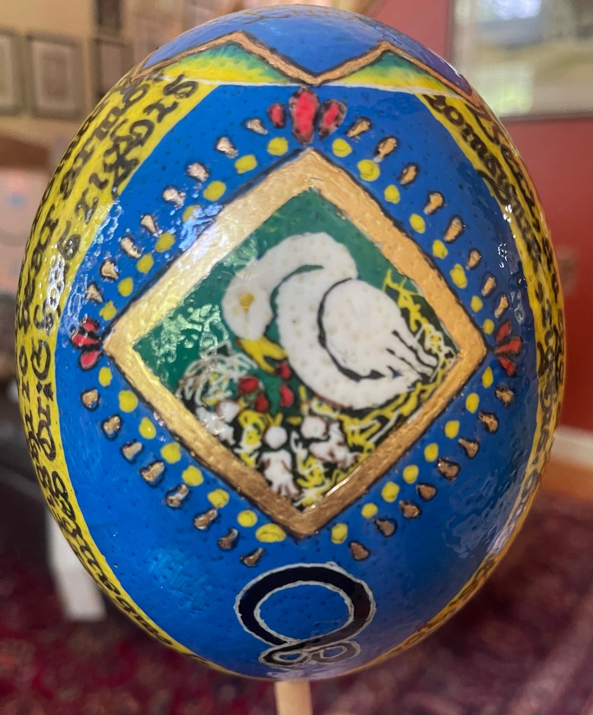
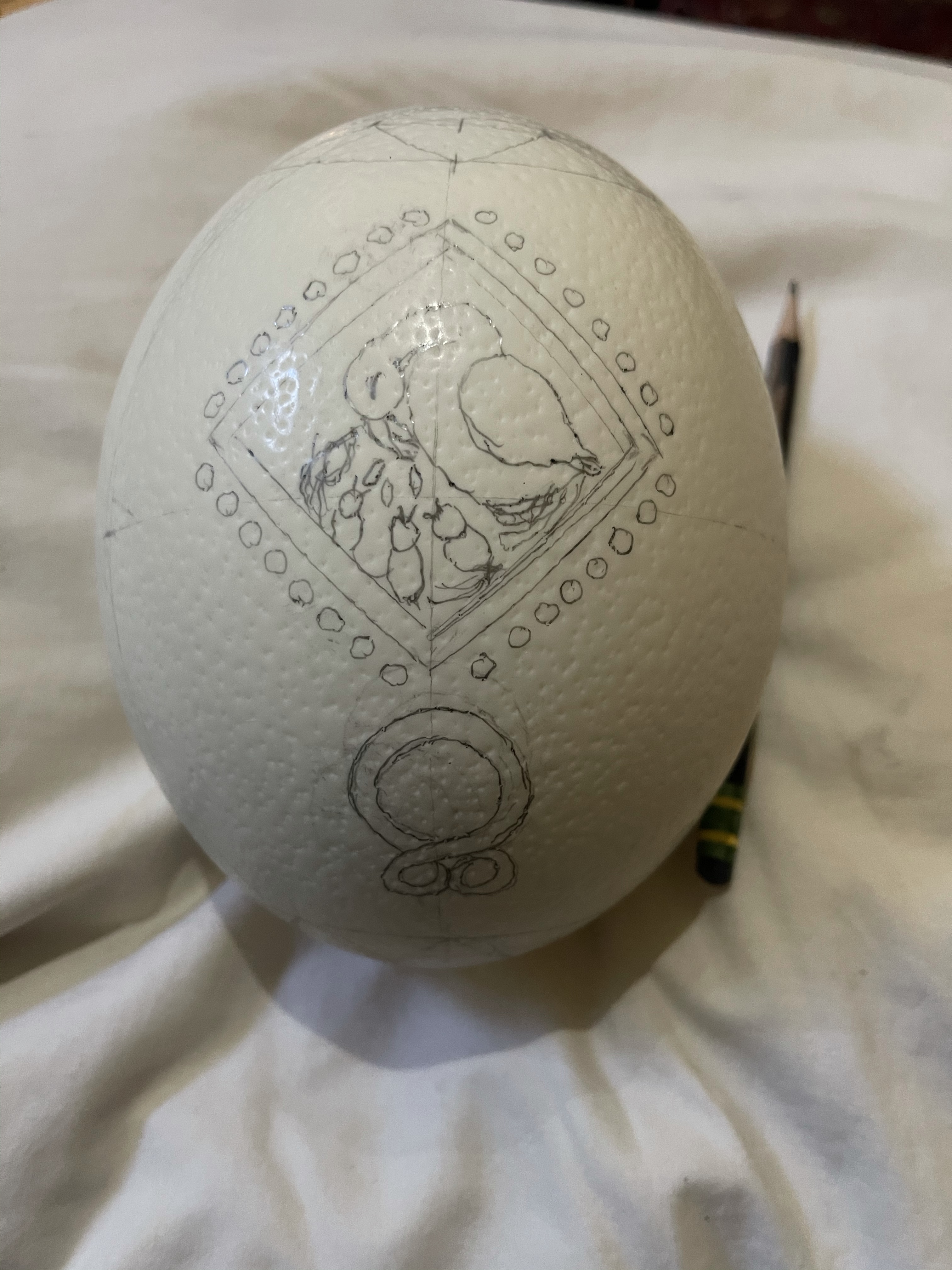
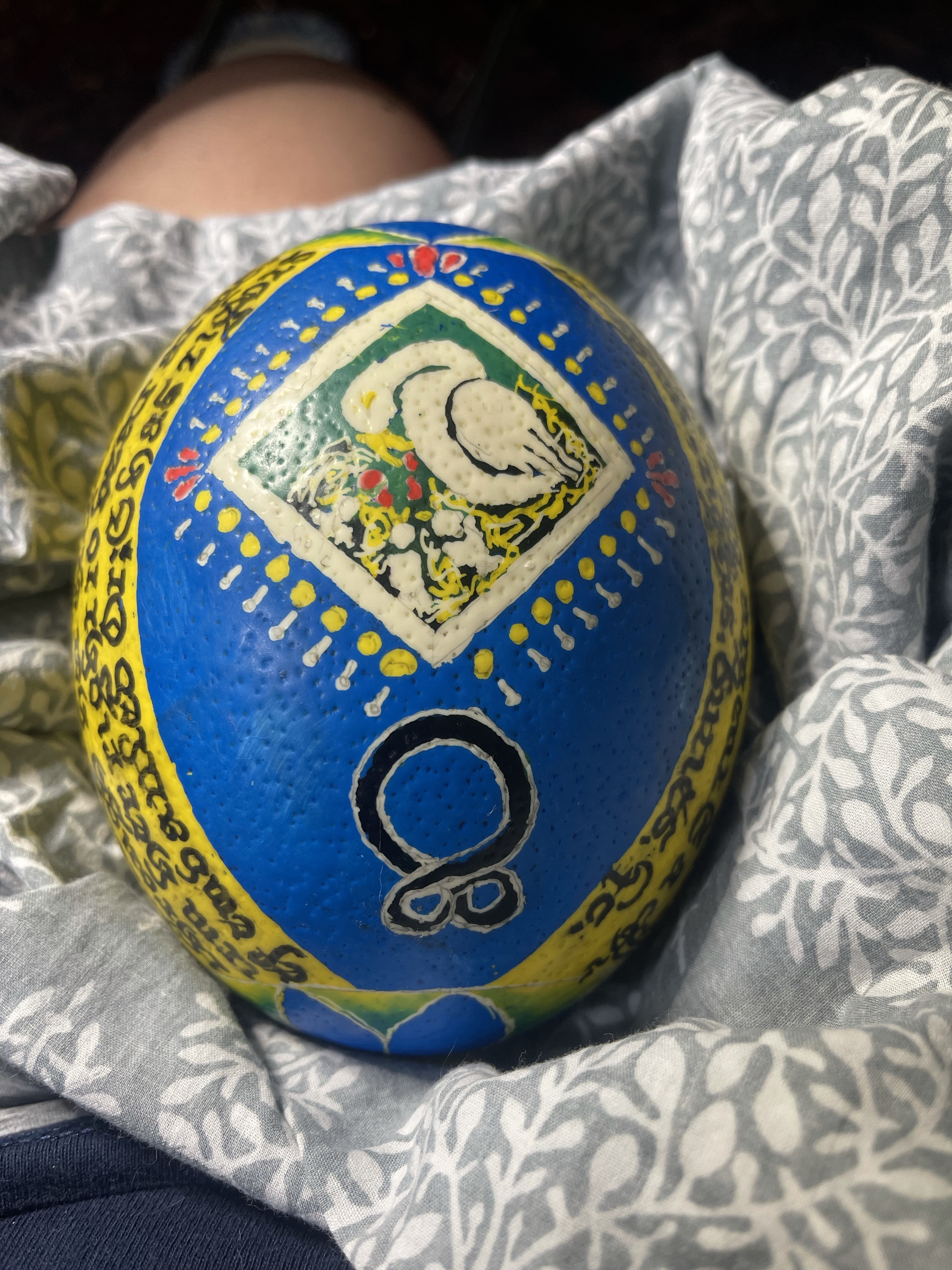
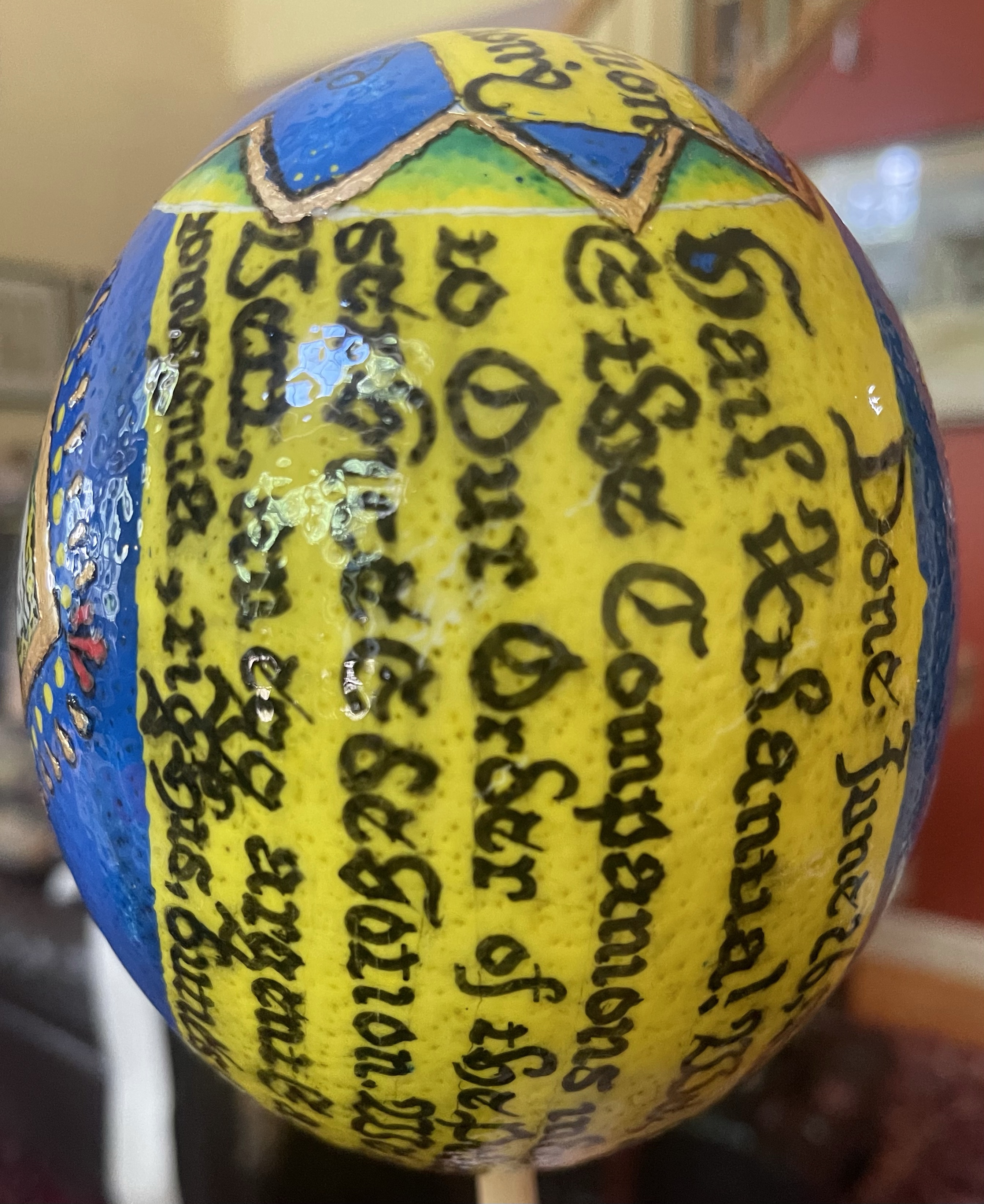
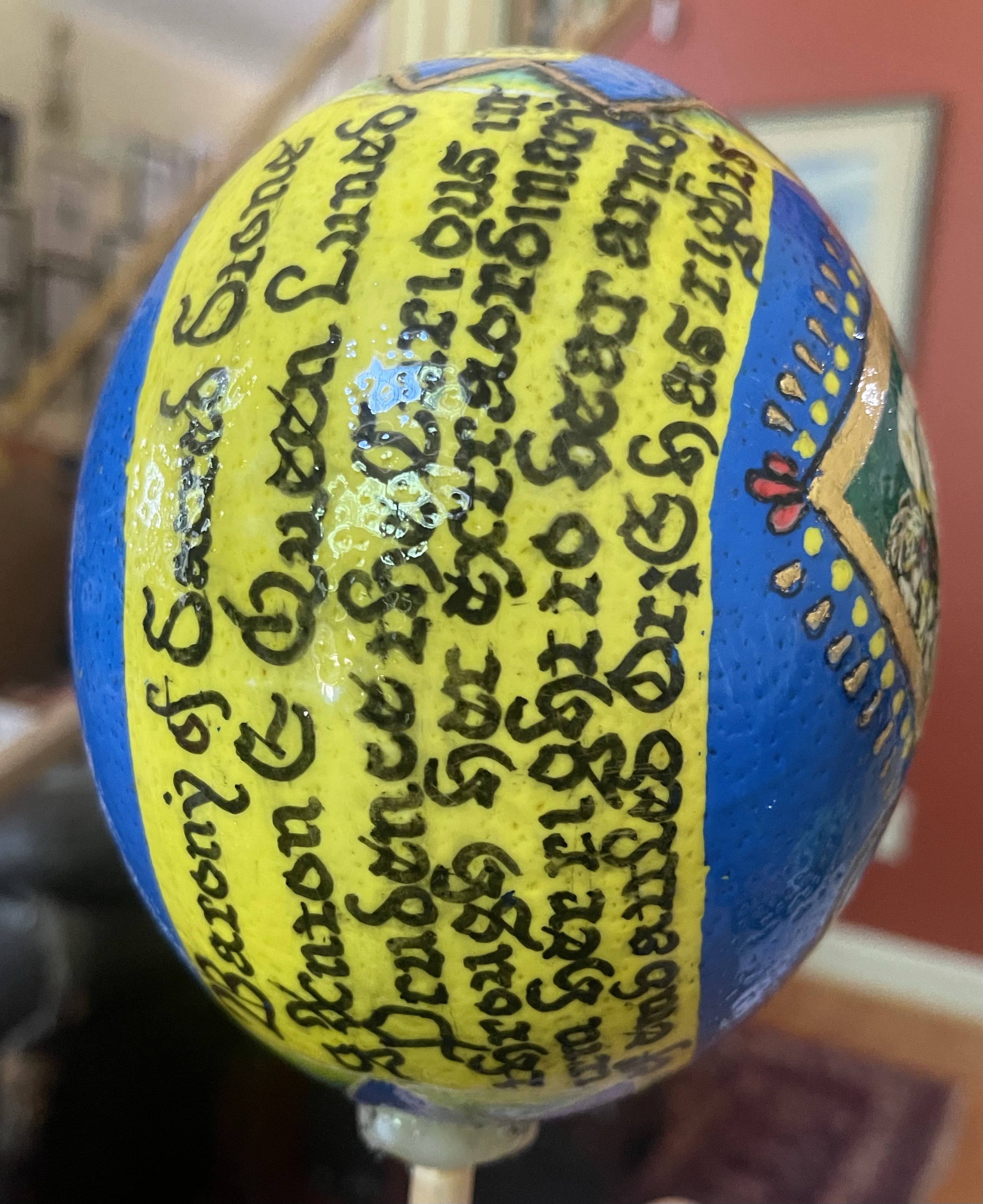
And now for something a bit different….this falls under my bucket list of scrolls. I had wanted to try Psyanky since I had seen a scrolled ostrich egg a few years back. The inspiration came from the recipient’s own heraldry which was an egg…how better than to give her one?
I understood the concept of Psyanky, and watched a TON of YouTube videos and bought two books. Then I purchased the egg and crafting supplies. I drew out by designs on graph paper first. Besides her egg heraldry, a large part of her service was through Troll; so I also drew a troll cross (or trollkors) which is not really an ancient symbol or rune, but thought to have come about this past century.
The egg’s shell was cleaned and stripped of its glossy coating, and I then drew cross lines and circles to aid in placement of the drawings, done with pencil lead until they were placed to my satisfaction. Bees wax and dying ensued, using a large gallon zippered plastic bag to swish around the egg and color (after first plugging the bottom hole). Half way through, I flushed the colors that weren’t covered by wax off in order to “restart” and prevent the colors from being too muddy – especially that of the main blue background.
Words were written using (quite anachronistically) a permanent Sharpie pen as period inks would not take and black dye would be a bit too transparent. One all was applied, the wax was melted off, some finger tips were singed, and the surface cleaned. The white remaining areas were then treated with miniatum and gold leaf. I chose such a modern size due to the porosity of the egg, the surface smoothness and the known stickiness and behavior of the miniatum. The last thing I wanted was for gesso to just pop off with time or handling. The bottom was sealed flat with wax, and the egg presented with a stand.
I confess to a great deal of enjoyment from trying Psyanky, and have purchased more accessories for further decorations. And possibly another award.
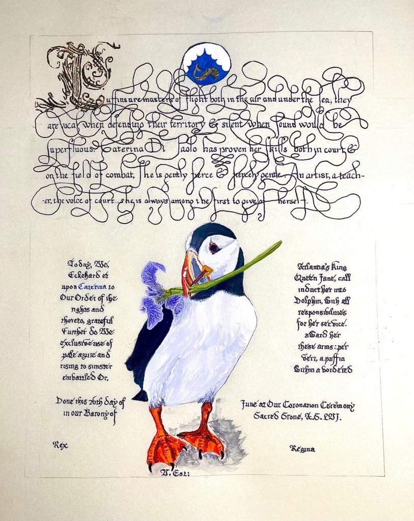
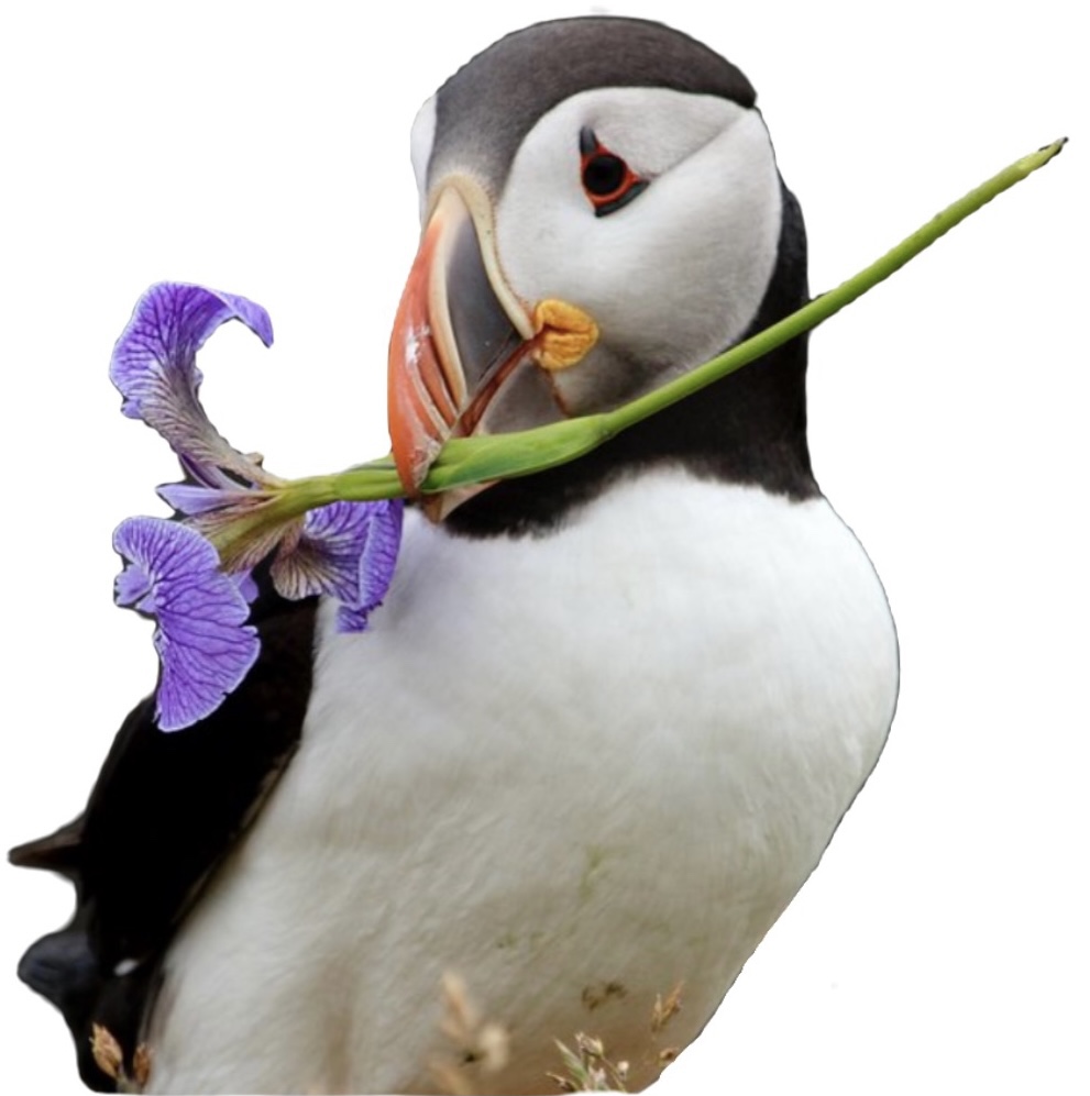
My first use of the Mira Calligraphiae Monumenta as an exemplar (more discussion on this exemplar here). This was one of those scrolls that came together so easily in my mind. The recipient is a dear friend and her heraldry is a puffin. Combining a puffin with Squashed Bug technique automatically brought to mind the Mira.
I found a photo with a puffin holding an iris (my favorite flower) in its beak (they use them for nests). Missing feet, I had to find another and adjust them to fit the flower puffin. I placed it below as with the Mira, found a pleasing text font from the exemplar and wrote her scroll, using one of the loops to surround the Golden Dolphin award.
This scroll is gouache on pergamenata with gold leaf on gesso for the cadelled primary letter.
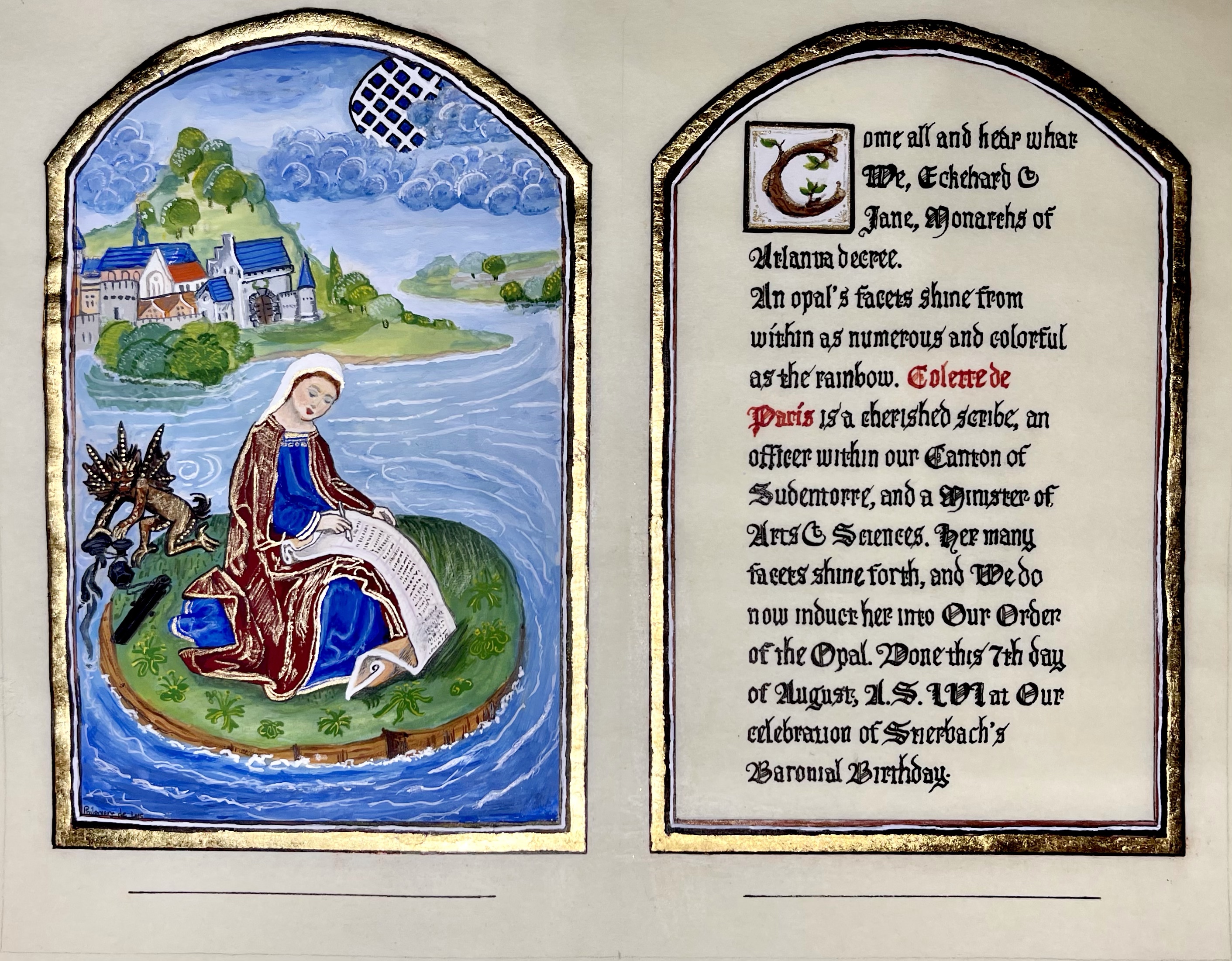
When I first received this scroll assignment, I knew exactly which exemplar I wanted to use. I’d had it in the back of my mind for quite some time and it would be perfect for a scribe. The difficulty occurred in finding the source, finding more than just a low resolution photograph and hunting down the source. The exemplar, from the “Libro d’Ore di Leonor de la Vega”, Bibloteca Nacionale de Espana, Madrid is (to my best knowledge) NOT digitized. I found ONE (luckily high-res) photo from foliamagazine.it from an article in 2014….entitled “San Giovanni Evangelista compone l’Apocalisse”, miniatura tratta dal ‘Libro d’Ore di Leonor de la Vega’ (Fiandre, XV secolo), Biblioteca Nacionale de Espana, Madrid. Even more fortunate was finding that clicking on the photo opened up a larger image…yes!
San Giovanni Evangelista compone l’Apocalisse
Now to personalize….I did remove a portion of the middle, the boatman, the eagle and other details were not pertinent to the recipient. Titivillus definitely was, the scroll was, and I made use of the city in the back to insert her barony’s heraldry onto the keep wall and to place her award symbol as part of the sky. I also stalked her on social media to find a photograph to use for her face.
All is gouache on pergamenata, the detail on her robe and on the demon is shell gold. The full scroll was done as a triptych with the wording adjacent and similarly framed. As an aside, I was trying to copy as closely as I could and realized that the original scribe had a very uneven white border which I tried to replicate. Finally, while photographing the final piece, I realized I had misspelled her name with only one “L”. Below is my correction, and my admission on this page because I think it is important to show errors and how you corrected them as well to admit to them, the better to learn (in this case the essential details!)
I admit to being in awe of the Mira. To have such an amazing piece of art done by not one but two artists far beyond their contemporaries is astounding. One, Georg Bocskay, showed the world what heights of calligraphy could be performed while the other, Joris Hoefnagel, created such realistic art to accompany each written page. They flow together seamlessly synergistically creating more than each separately.
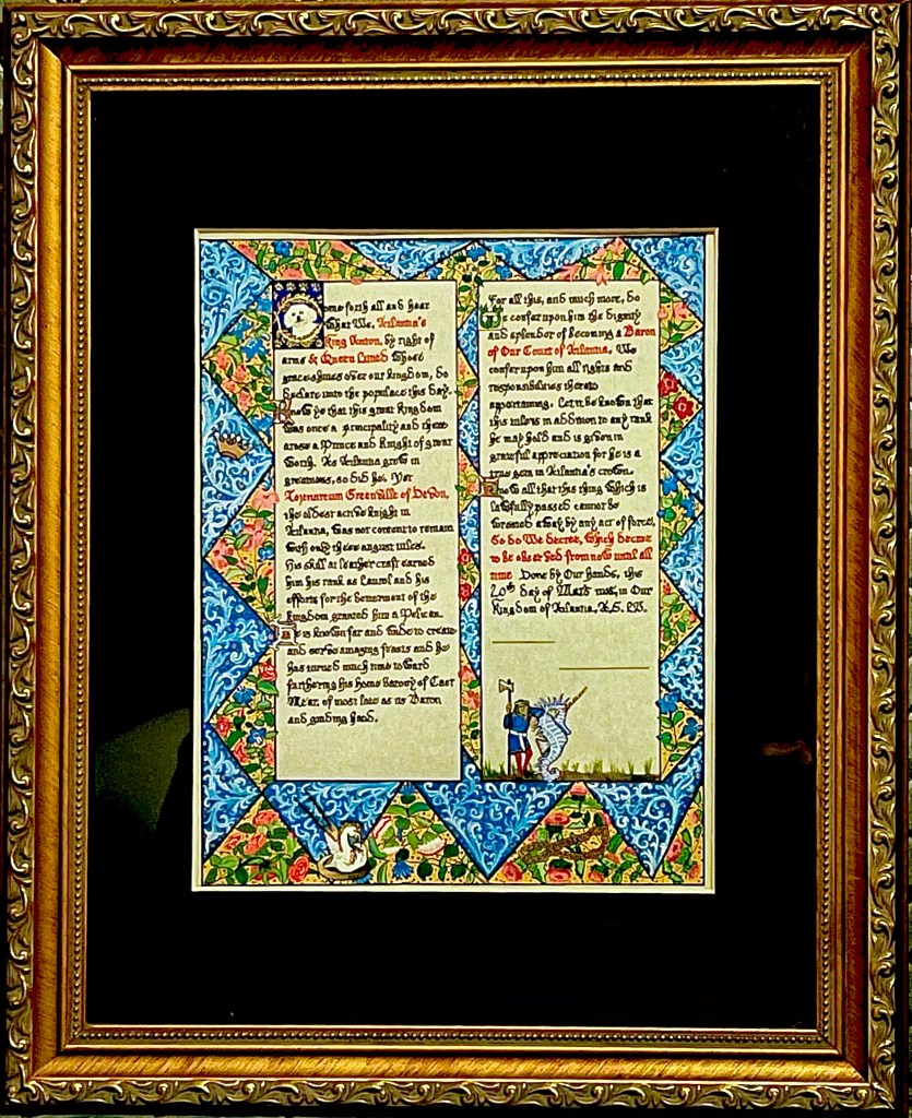
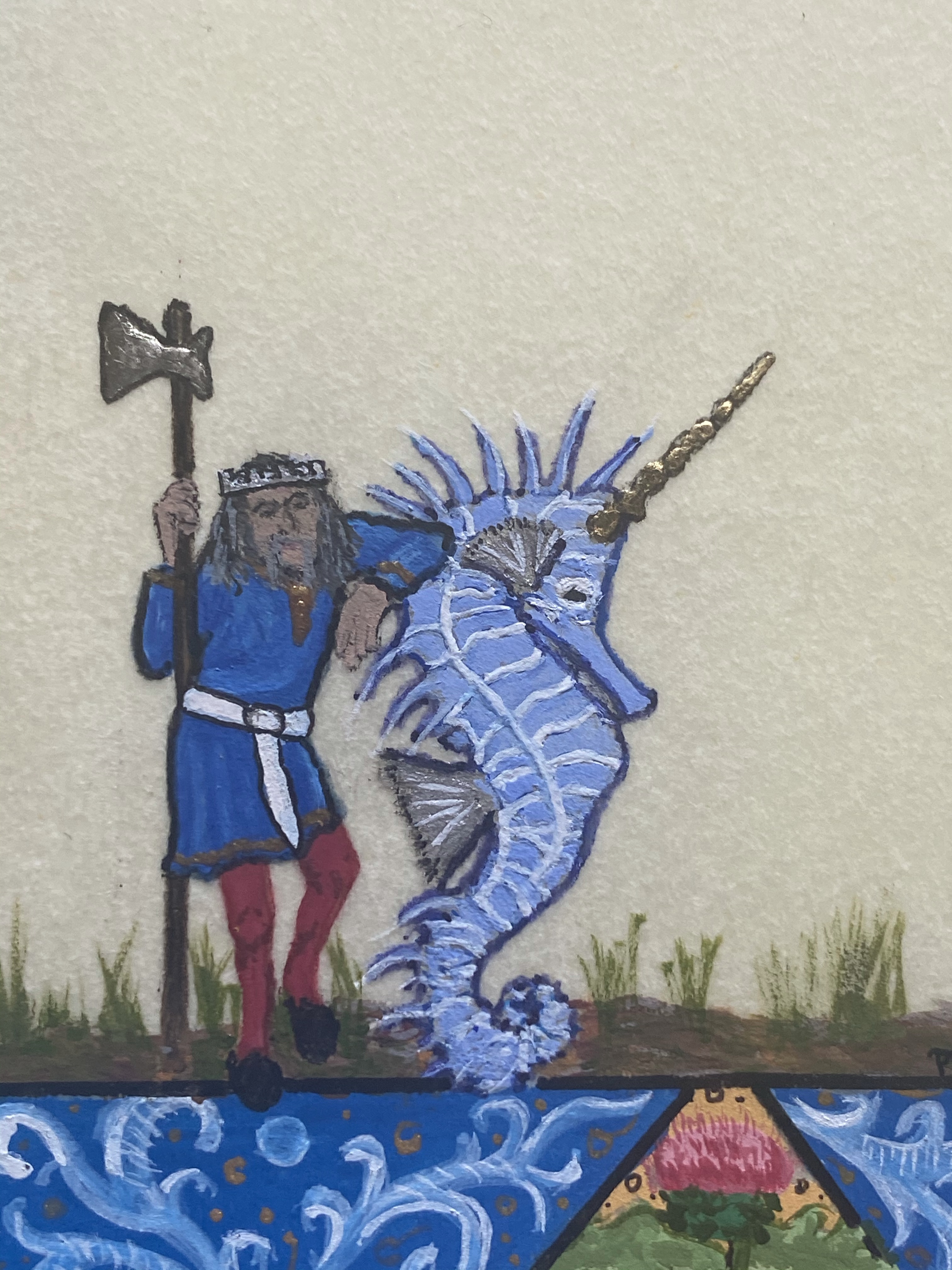
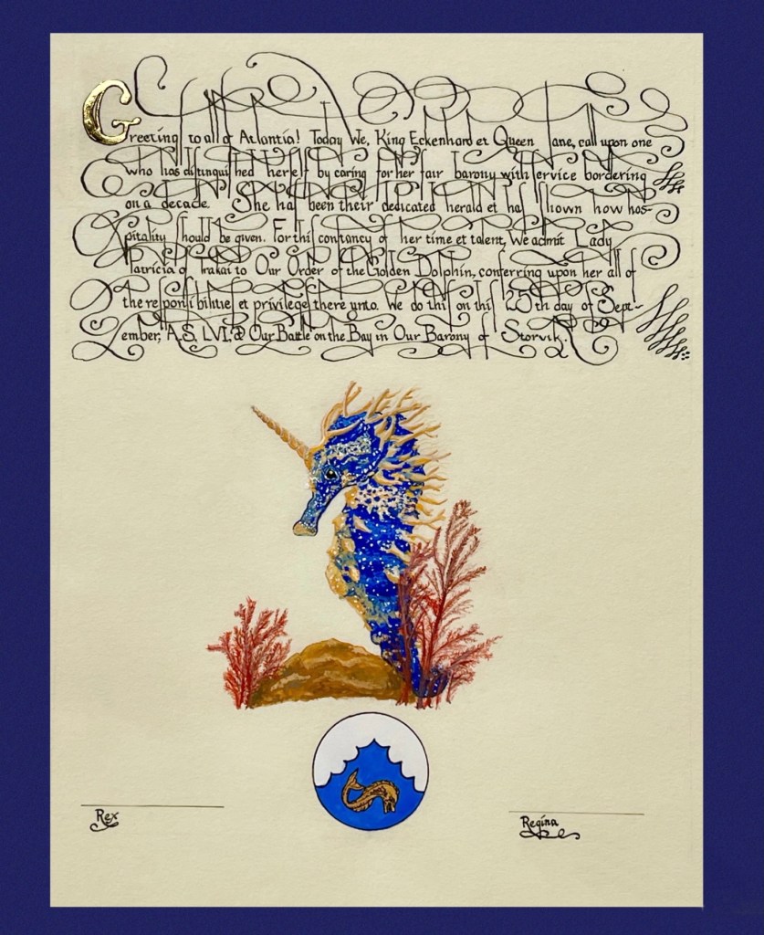
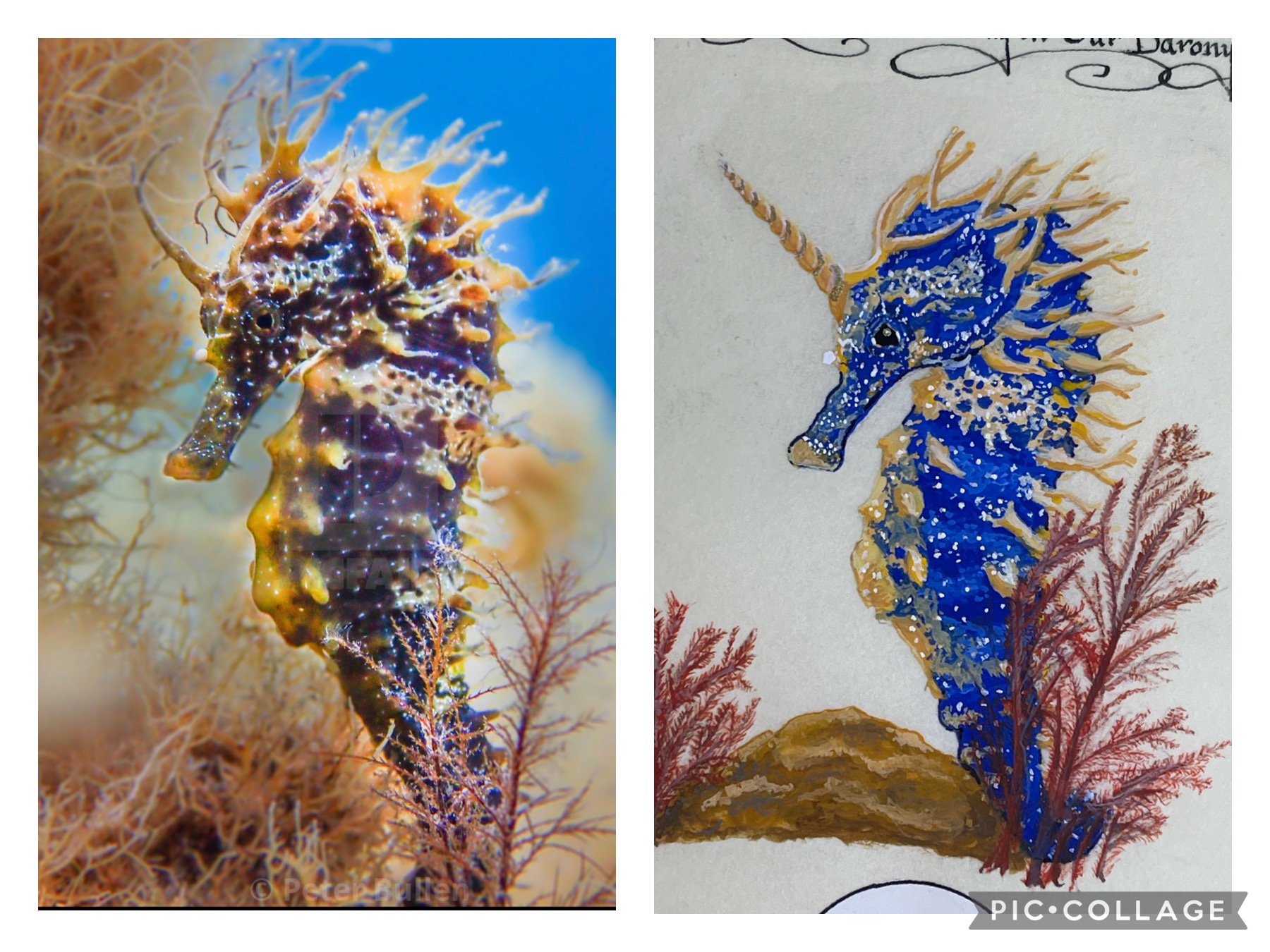
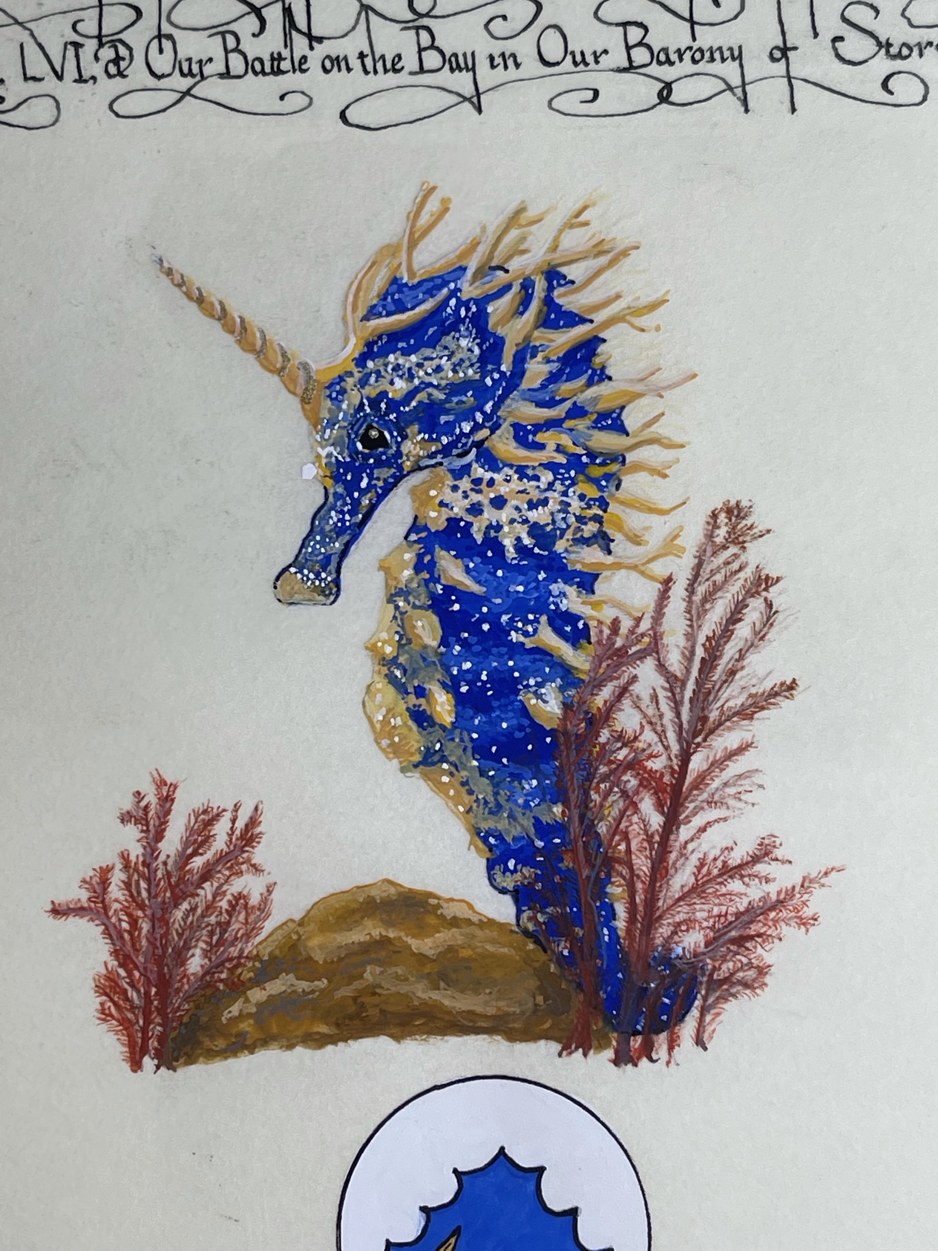
The recipient of this scroll specialized in hospitality and service to the kingdom. To me there is no better example of a representative of Atlantia and all that it embodies than Spike, our horned seahorse.
Wanting to do this in the Squashed Bug style, I searched for a photo of a seahorse that appealed to me and had a nice coronet. I did find the one that I used as a model, but that one was orange, and this being Atlantia, Spike most definitely had to be Atlantian blue.
Spike is all done in gouache with a bit of shell gold along the spiral of his horn (hard to photograph). The calligraphy is my take on one from the Mira. Studying the photos zoomed in shows just how Georg Bocskay created his swoops and swirls around the letters. My take has the words closer together (line to line) than the exemplar due to the wording in the scroll.
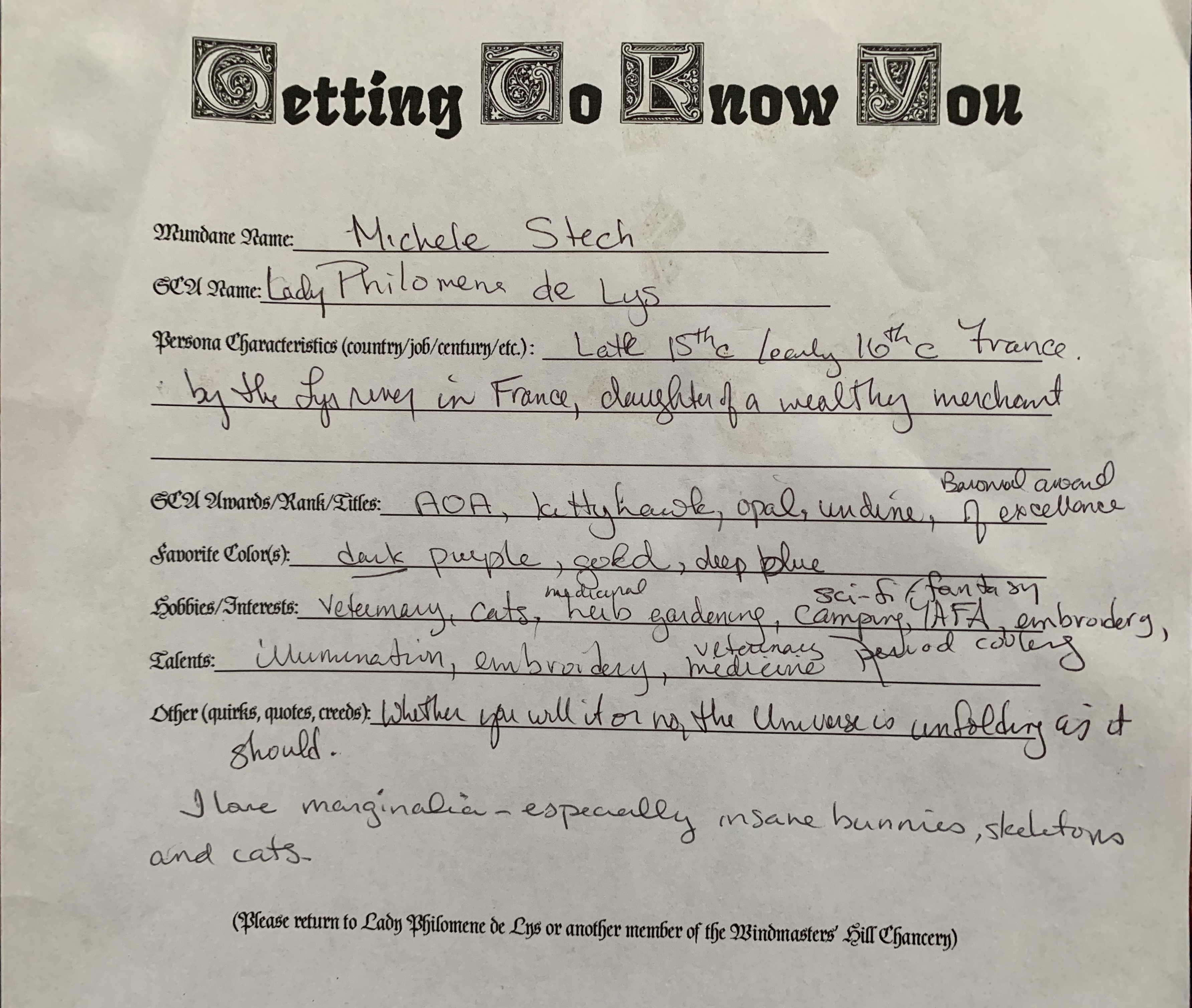
As I previously stated, I feel strongly about making the presented scroll pertinent and personalized to the recipient. For some people, this may be their only award ever, which is totally perfect if that is their wish, but if so, let’s make it the most awesome scroll for them! I thought about this quite a bit…and while I know some folks (and more as time passes), I don’t know everybody. Facebook stalking only gets you so far if you are not friends with that person or a friend of a friend. Other scribes have got to feel the angst in not knowing the person to whom you’re assigned, no? What to do?
I came up with a plan. I created a “Getting to Know You” form for the folks of our Barony…start local and hopefully move outward from there. If I can get folks into the Chancery database, then any scribe can have access to basic information. Yes, these would become dated as folks received awards, etc., but at least the basic things (favorite colors, name spelling, etc.) should remain fairly constant. Below is mine, filled out. I brought blanks to canton meetings and some events. My next goal is to put it into a google.doc and put it up on our Baronial page.
This award was for the son of a friend. This young man is amazingly helpful and always cheerful, and I am proud to call him a friend as well. His persona is Japanese, so truly outside my (admittedly limited) experience. I wanted to find something to strike a chord with him. I asked his mother for some help…favorite colors, persona, spelling of the name, as he hadn’t been officially registered with the SCA at that point, if I recall correctly. I found a Persian pen and ink drawing of a dragon that was just awesome and started there.
17th c. Persia, Safavid, ink on paper. I believe this was up for auction and I found it in Pinterest.
So, now what? I had a lovely dragon, but how to create the rest of the scroll? My Laurel-to-be suggested a wash like in traditional Japanese landscapes. I’ve never done ANY watercoloring, let alone a wash. Online videos helped. I used the blue color that the recipient favored and attempted the wash. The color graduation was quite nice. Pergamenata does NOT like water. It buckled and warped like a black hole despite being taped on all 4 sides. Looking back, less water would probably have worked just fine, although it may have been more lined and not blended.
After that, I wanted to keep the feel going with the dragon so I drew smoke from his nostrils, modeling it on the traditional flow of Japanese painting of air currents. I wrote the words within the smoke as emanating from the dragon. His award was the Eurus, named from the Greek god of the East Wind. Smoke/wind/words. All air currents.
Gouache on pergamenata, Micron ink with diluted Noodler’s eternal for shading on the dragon, stones and smoke.
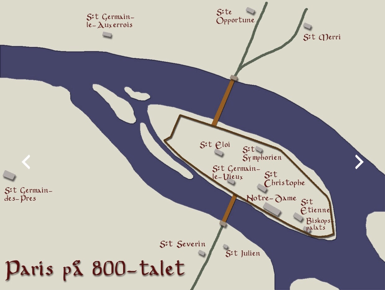
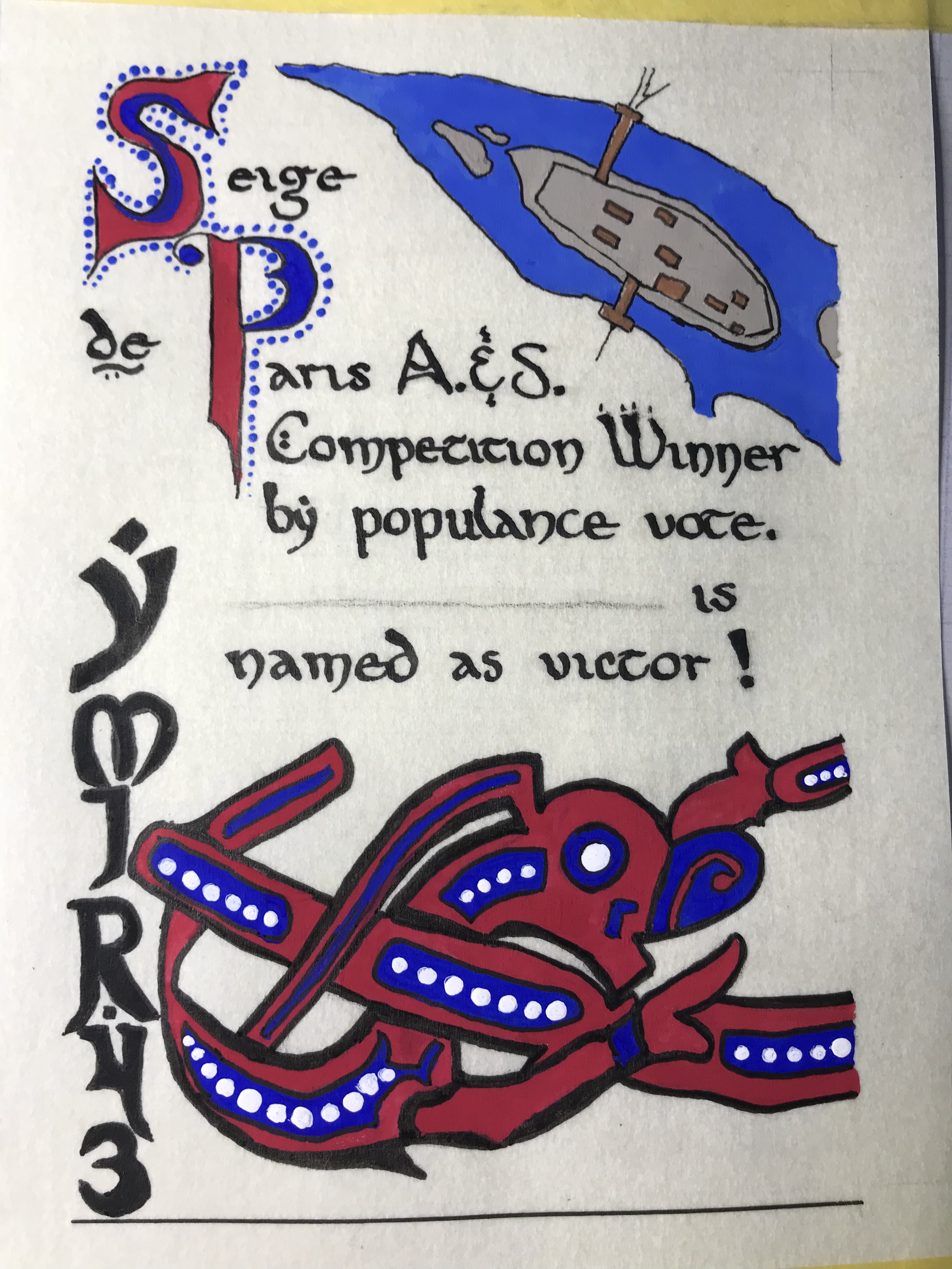
My Laurel (not officially so yet) was running the A&S competition at Ymir 43. This year’s battle was to be the Vikings’ siege on Paris. Just as the battle sides were divided, so too was the competition. The winner, by populous vote, would have produced either a Viking or French item. The award scroll had to represent either.
Looking for inspiration, I read up on the battles, and found a lovely map of 9th C. Paris (basically what is now Île de la Cité). Perfect and pertinent! Now, Viking….obviously not a ton of scrollwork from them, so I looked toward grave and hoard finds. There was a beautiful hammered cup from which I took the creature’s form and painted it, straightened out, onto the scroll. I considered going with gold or silver for its lines, but it would have made the map look rather drab and besides, my French persona would like to make a subtle (?) jab at the Viking invaders who dared blackmail my country, and I painted that creature in the colors of the French flag 🇫🇷 …Tiens (take that)!
The calligraphy is poor, hindsight making it seem more so. I believe that I did this before I had my “a-ha” moment with calligraphy and hands and the lettering is too large and difficult. The formation of them was a struggle…probably had my tongue stuck out in concentration and sweat beading my brow. I placed the award scroll in a small frame for presentation.
Gouache on pergamenata, Micron pen outline.
As an aside to the aside, we, at the Chancery, realized that there were a few things that needed to be adjusted. Some folks had never received their scrolls, and others were being awarded “impromptu” commendations by the nobility. We thought that a promissory scroll was just the thing. The receipient would have something physical to take home that day and it bought us time to be able to create something beautiful for them rather than use an off-the-rack blank. Not that some blanks aren’t beautiful, but we really didn’t have any of those either! Below is an example of the promissory scroll:
Noodler’s ink, braus nib on pergamenata. Fraktur hand. Obviously, the pencil lines would be erased!